
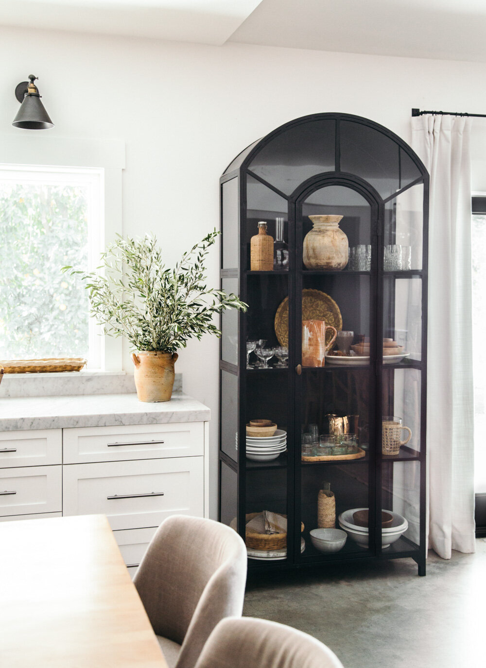
How to Style a Display Cabinet
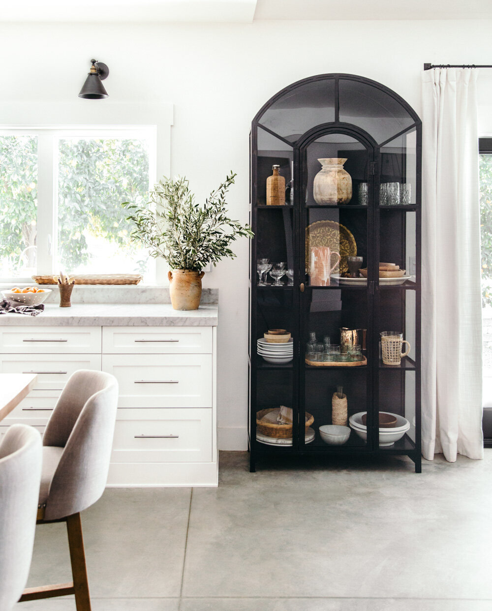
Let’s talk about how to style a display cabinet. I want to walk you through some simple steps and concepts that will have you thinking like a stylist by the end of the post! I’m going to help you understand how to style a cabinet in a balanced and artful manner - with confidence. To further encourage you, I did not buy anything new for this post. I reworked pieces I had on hand from around my home, and you can do the same. What I want you to know, is that styling is an artistic skill that can be studied and mastered. The ability is not attained from buying things, but from learning how to arrange them. Let’s go!
COMPOSITION
To put it plain and simple, styling is all about composition. The definition of composition is the act of putting something together, or the combination of elements or qualities. With styling, the purpose of composition is to capture attention, direct the viewer’s eye around the scene, and establish visual balance so that everything feels engaging yet harmonious.
Much of what we’ll touch on in this post will be examples of composition. It can be a bit complex to master, since a lot of it comes down to experience and creative intuition. Studying art, photography, and design will help train your eye.
There are many different compositional models you can follow, but here are a few simple things to keep in mind:
Visually, objects look more interesting when arranged asymmetrically and in groups of odd numbers.
Keep from placing objects of similar shape, size, texture, and color too close together, as they will appear bulky.
Instead, evenly disperse or weave similar props throughout to keep the eye interested and moving through the display.
CONTRAST
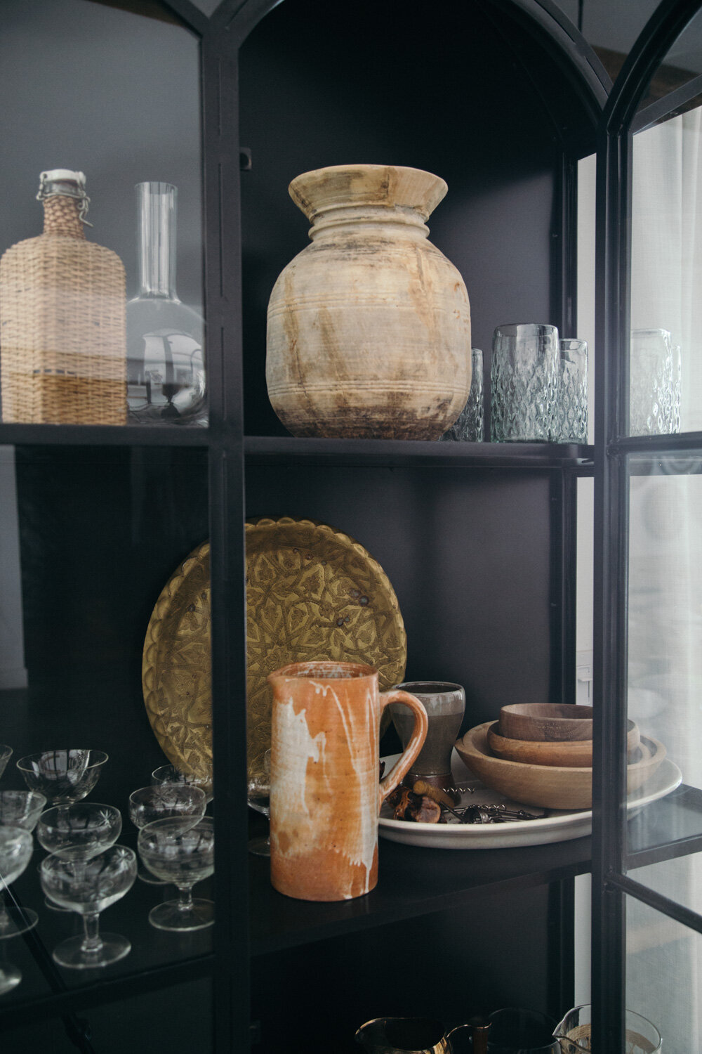
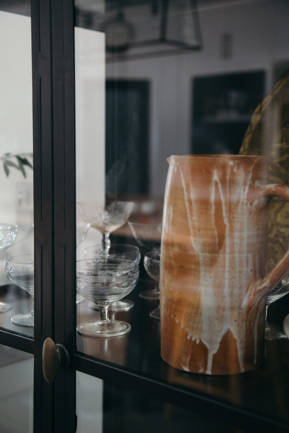
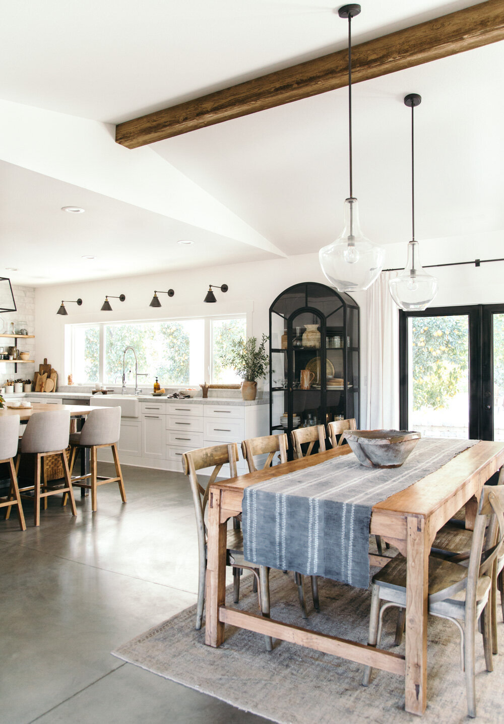
You will want to include items in contrasting shades and textures. For example, my cabinet is black, so the items I chose to style with are lighter in color and contrast well against the dark background. Black decor pieces would not work in this setting. If your cabinet is lighter or white, dark pieces would contrast nicely. A bonus with white cabinets, is that you can include pieces in various shades of white because there are so many gradients of the color - from the purest white to alabaster to cream, and those variations provide contrast, where as the color black itself does not.
Another way to add contrast is with different surface textures like wicker, stoneware, glass, and wood. Each offer an element of contrasting texture and color to the dark cabinet, as well as to each other. Think about mixing smooth shiny surfaces (glass or metal) with worn rustic textures (wood or pottery). This approach adds depth and interest to your styling.

COLOR PALETTE
I recommend starting with three foundation colors and building it out from there. My warm neutral color palette is defined by various shades of brown and terra cotta. As you practice and learn more about composing with color, you can weave color through your styling. For example, notice how the brown tones are composed in a curve, starting from the top shelf then weaving its’ way down to the bottom. This technique carries the eye through the entire display. For bonus points; did you catch that the white ware and glasses create the same effect?
SCALE & HEIGHT
To prevent your composition from feeling flat, you will want to include items of different height and scale. For example, I have several larger scale pieces that nearly fill an entire glass pane in my cabinet - the wood vase, stoneware pitcher, and Moroccan brass tray. Smaller items are kept in groupings or on trays to visually give them a larger scale appearance.
Displaying objects of varying heights helps to create movement and will prevent your styling from appearing one note. Notice how the vintage champagne coupes above are various heights and artfully composed. If you have glasses of the same height, stagger them so they feel layered. Other ways to create height are with trays propped up, tall pitchers or vases, or objects that stack well together - such as bowls, plates, and platters - which takes us to our next technique, layering.

LAYERING
Creating layers will add depth and interest to your styling. You can achieve this several ways. One technique is to layer an item partially in front of another. By overlapping pieces, your styling will appear more visually appealing than having them displayed side by side. Other ways to incorporate layers; with a stack of bowls or platters, a pile of linen napkins, a platter propped in the background, or by setting objects on a tray or in a basket. Keep in mind, you’re trying to create dimension.
YOU ARE THE STYLIST
Although styling has definitive methods and techniques when creating editorial images for magazines, in your own home - You. Are. The. Stylist. When you compose and style a room or vignette, you decide what is pleasing. Yes, styling is a skill, but it is also an art form. If you gave two artists the exact same paint colors and brushes, they would create two completely different paintings because they have very different visions of what they want to compose. The same is true for you!
If you struggle with styling an area, meaning, it doesn’t match your vision, take a break and come back to it. I do this on-set all the time while under a very tight timeline. You certainly have the luxury of time on your side to rework and improve it until you’re able to create the beauty you have envisioned for a space. Learning how to style should be a fun process for you!
I could literally talk for hours on end about styling. There is so much nuance to the artistic skill and profession. I feel like we have only touched the surface today, but hope that in some way it was very helpful for you. As always, I’m happy to answer any questions you might have in the comments!
PROP SOURCES FROM THIS POST
